5. MOSAIC WEB
MOSAIC’s web interface is designed to allow you to easily setup and run an analysis, or to visualize and analyze the results of previous experiments. It contains the most commonly used features of MOSAIC. The web interface consists of a series of screens that allow you to set up and run an analysis. The interface keeps track of all analysis within the current session so it is easy to go back and compare data sets. The web interface is designed to allow you to easily run the most common use cases. For more complicated analysis, please refer to the Scripting and Advanced Features section.
Opening the Web Interface
The web interface can be run locally, allowing you to run a MOSAIC analysis from within any modern web browser. If you installed MOSAIC from a precomiled binary, you can start the web interface by double clicking the MOSAIC icon. Alternatively, if you compiled MOSAIC from source code, you can run the GUI from the terminal window – navigate to the installation directory and type:
python runMOSAIC
This should start a local copy of the MOSAIC web server and open a new browser window that launches the web interface. Running servers can be accessed at anytime by opening a browser and entering http://localhost:5000 in the adress bar.
5.1. Interface Overview
The main screen of the MOSAIC web interface is the starting point for running new analyses or reviewing previous runs.
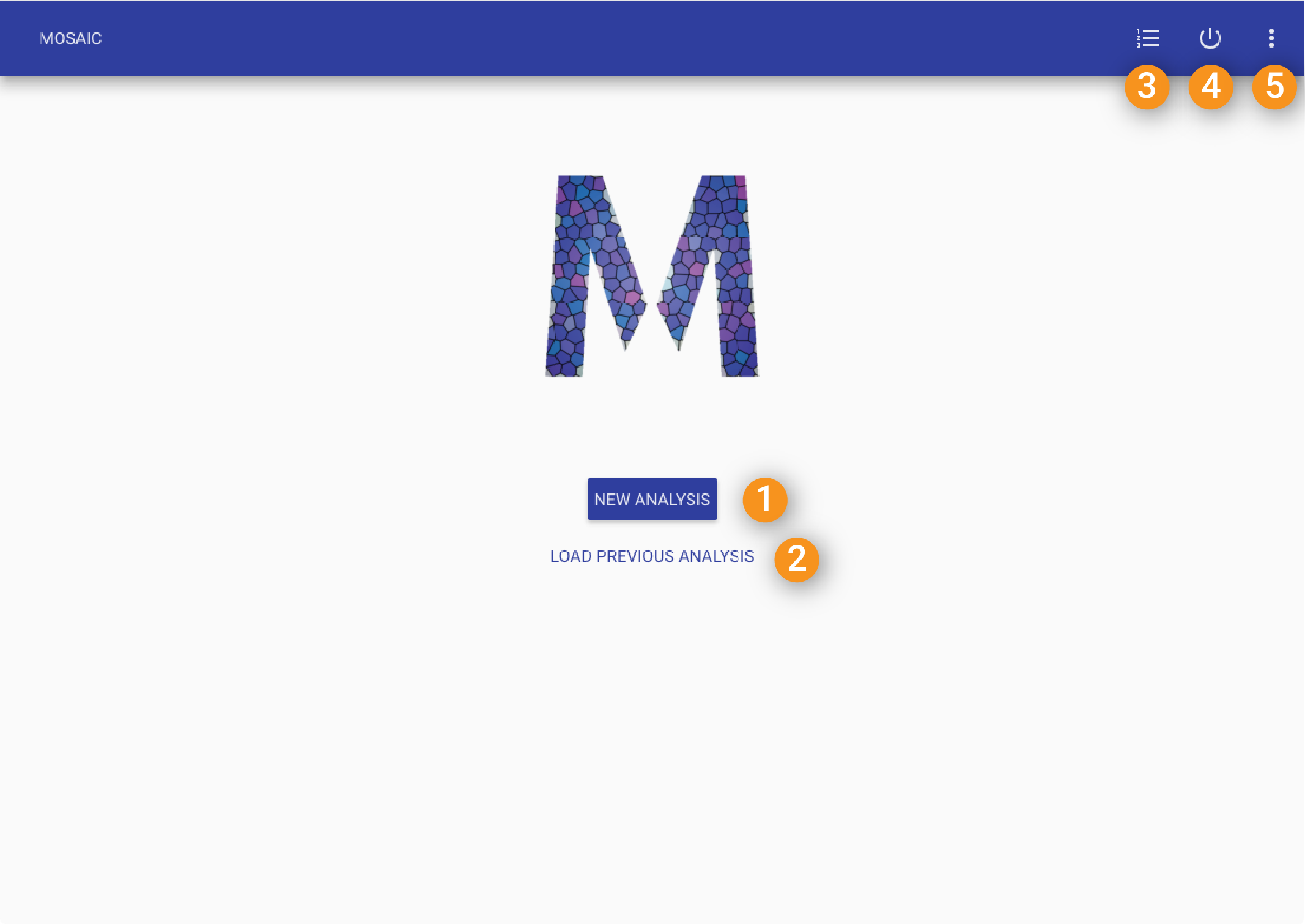
The main screen of the MOSAIC web interface allows new analyses to be set up or previous runs to be retrieved.
5.2. Data Source Path
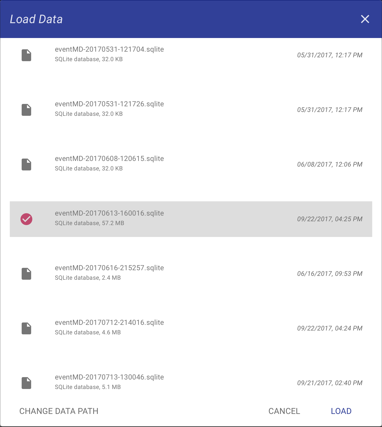
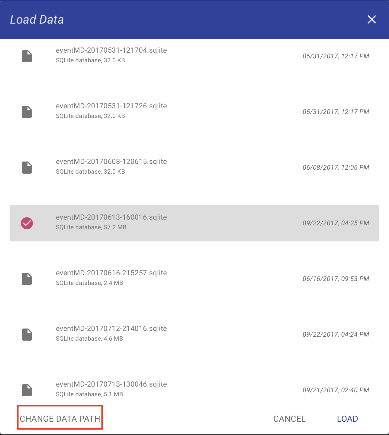
The path of the data source can be changed when MOSAIC is run in local mode, i.e., when it is run entirely on a local machine. This is the default configuration of the pre-compiled binaries. When running MOSAIC from source it can be enabled by editing the global.json file.
The data source path can be edited when starting a new analysis or loading a previous analysis by clicking the CHANGE DATA PATH button shown in the figure below.
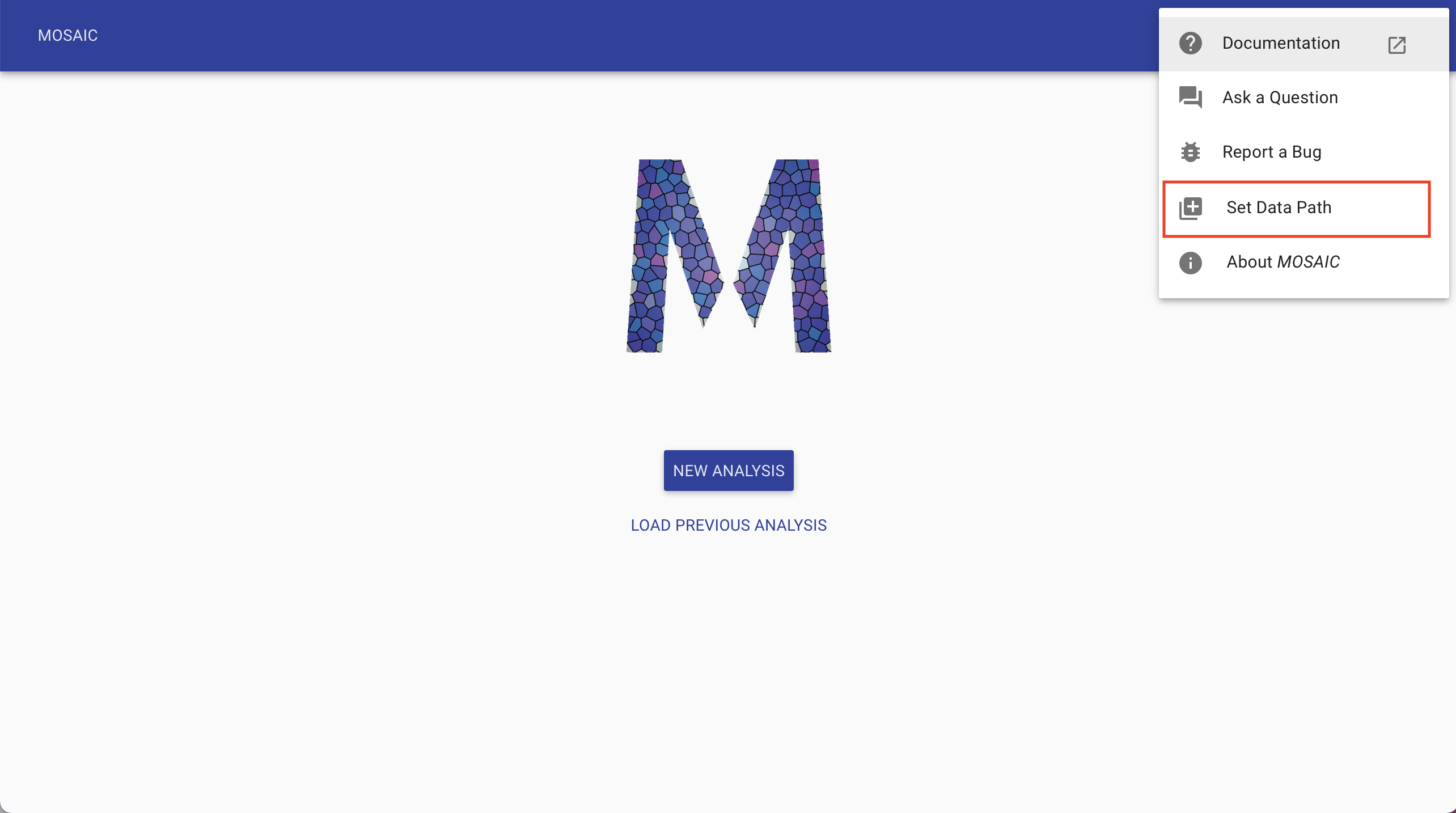
The setting can also be accessed from the overflow menu at the top right and then clicking Set Data Path as seen from the figure below.
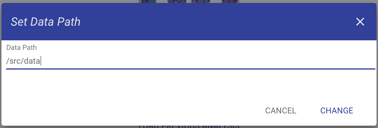
The new source data path can be entered in the resulting dialog. Click CHANGE to save the new path.
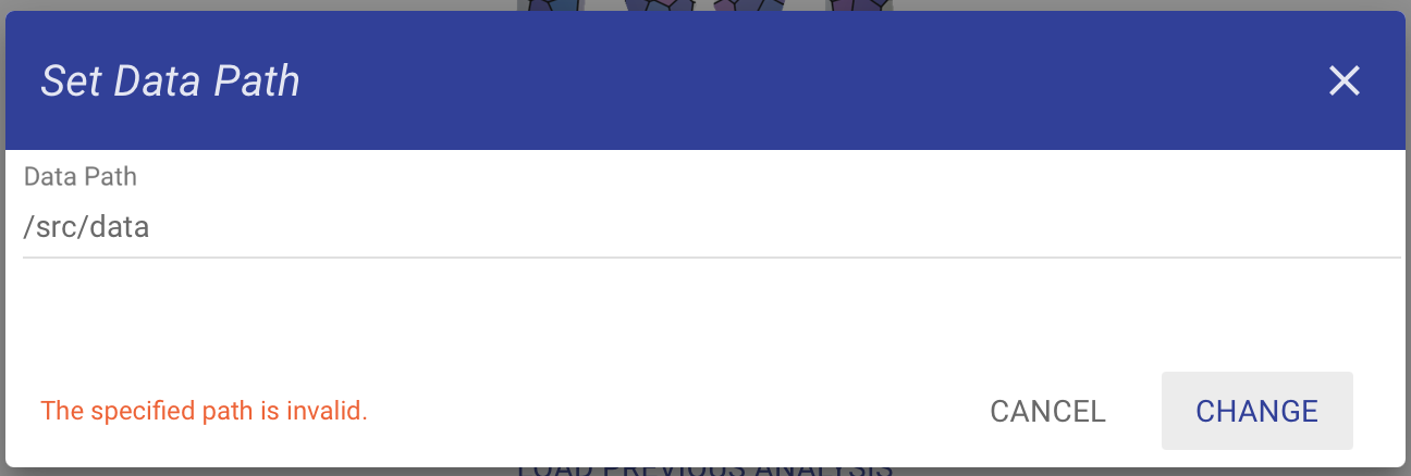
If the new path is invalid, an error message will be displayed and the path will not be updated as seen below.
5.3. Analysis Settings
The analysis settings interface displays the data trajectory and allows one to set up and run an analysis. Below we present an overview of the different settings available on this screen. The numbered sections correspond to the numbers in the figure below.
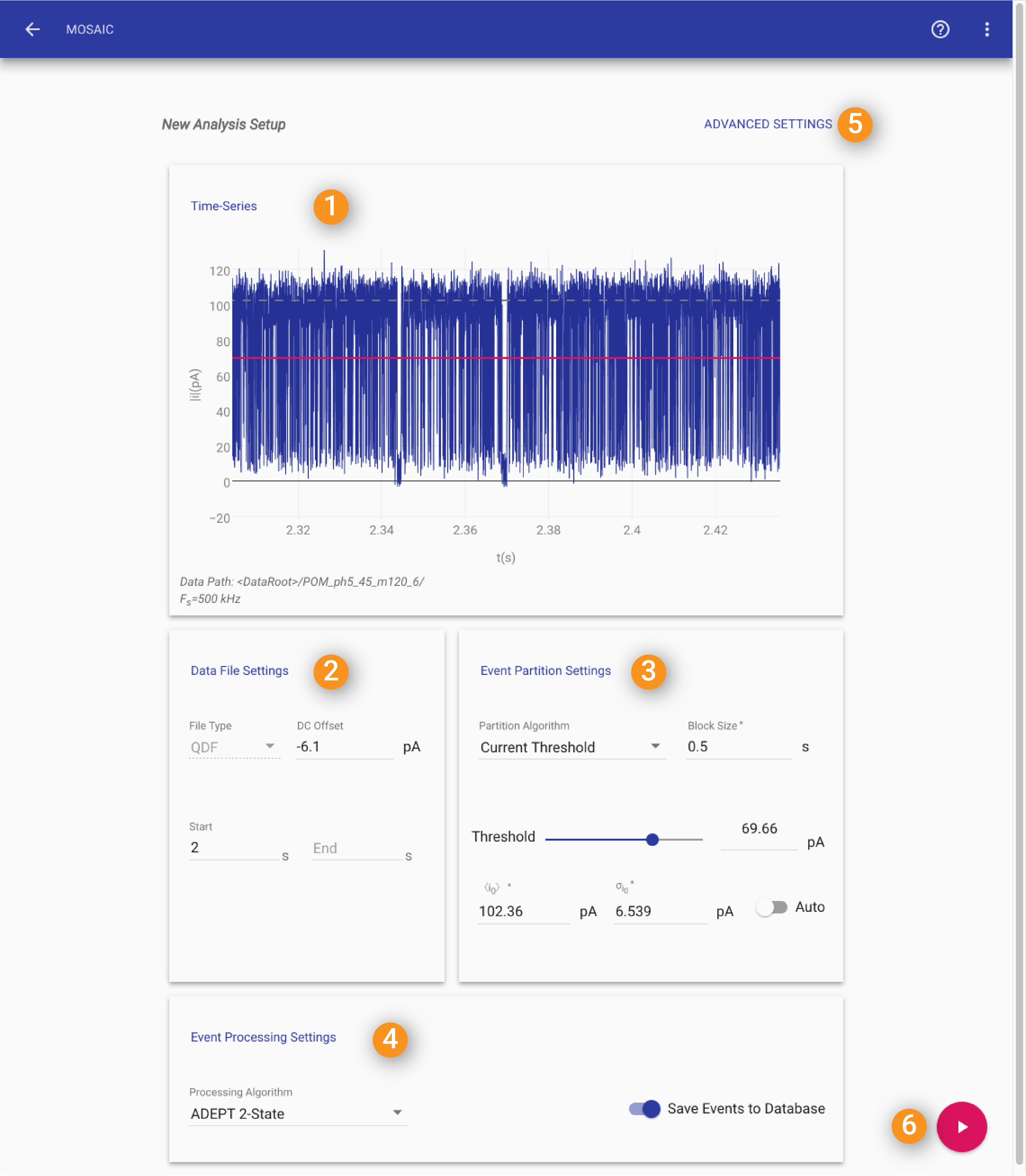
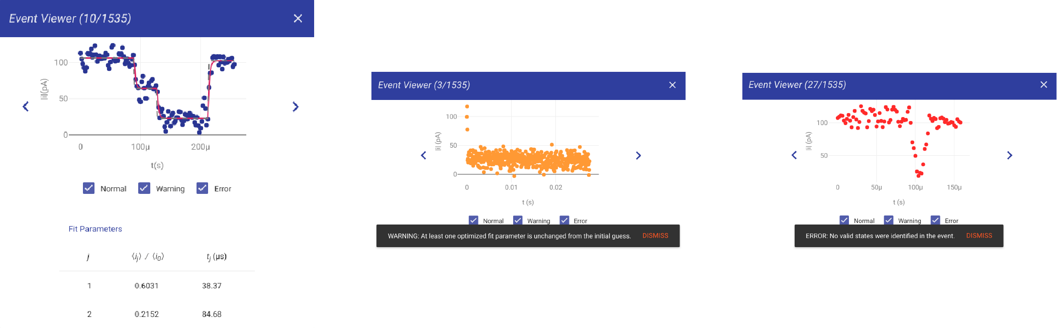
1. Time-Series
This section of the analysis settings shows a segment of the data time series. The length of time-series displayed is determined by BlockSize parameter in #2.
Gray Dashed line: The gray dashed line in the time-series display indicates the mean baseline current (\(\langle i_0\rangle\)) as estimated in #3.
Solid Red line: The red line in the time-series indicates the threshold current set in #3.
Data Path: The location of the data filesand currently being displayed is shown at the top of the window. If data from multiple files are loaded, the last filename is displayed.
Fs: The sampling frequency of the time-series data in kHz.
2. Data File Settings
File Type: The web interface is natively compatible with ABF, BIN or QDF Files. If the data path contains any of those file types this field is automatically populated.
DC Offset: If your measurement contains a systematic bias, it can be manually corrected by entering the DC offset here.
Start and End: These parameters allow you to analyze a range of your data. Choose the starting and ending times if you’d like to analyze a small time segement of your data. If both fields are left blank, all data will be analyzed. If the End field is left blank, the data segment from Start to the end of the data will be analyzed.
3. Event Partition Control
Partition Algorithm: Currently, the only event partitioning algorithm available is CurrentThreshold.
Block Size: Controls the amount of data used to determine the baseline. This setting also controls the amount of data shown in the trajectory viewer.
\(\langle i_0\rangle\): Mean open channel current, in picoamperes (pA). This is shown using the gray dashed line in the time-series viewer (see #1). When Auto is selected, this input will be disabled.
\(\sigma_{i_0}\): Standardard deviation of the open channel current noise in pA. This is expected noise level of your baseline. Typically one would set this to the measured standard deviation of the open channel current at the cutoff frequency. When Auto is selected, this input will be disabled.
Auto: Checking this box enables automatic dectection of \(\langle i_0\rangle\) and \(\sigma_{i_0}\).
Threshold: The slider and correspnding text input can be used to set the current threshold used to determine the start of an event. This setting is used by the CurrentThreshold algorithm to perform an initial partition of the time-series into individual events.
4. Event Processing Setup
Event Processing Algorithm: The GUI supports two event processing algorithms, i) StepResponseAnalysis and ii) MultiStateAnalysis. StepResponseAnalysis is the default analysis, and should be used with data sets with unimodal events. For events with mutliple states or steps the MultiStateAnalysis algorithm, which is capable of automatically analyzing events with N states, should be used. Note that StepResponseAnalysis is a restricted case of MultiStateAnalysis and is more computationally efficient to run if you have unimodal (or single states) data.
Write Events to Disk: When this box is checked, the data points for each partition events are written to the SQLite database. When this is checked it is possible to view the individual fits of each in the Event Fits panel.
Hint
When Write Events to Disk is checked, your database can become extremely large! This is because MOSAIC is effectively writing most of your time-series to the database. Note that the fit parameters are always written to the database.
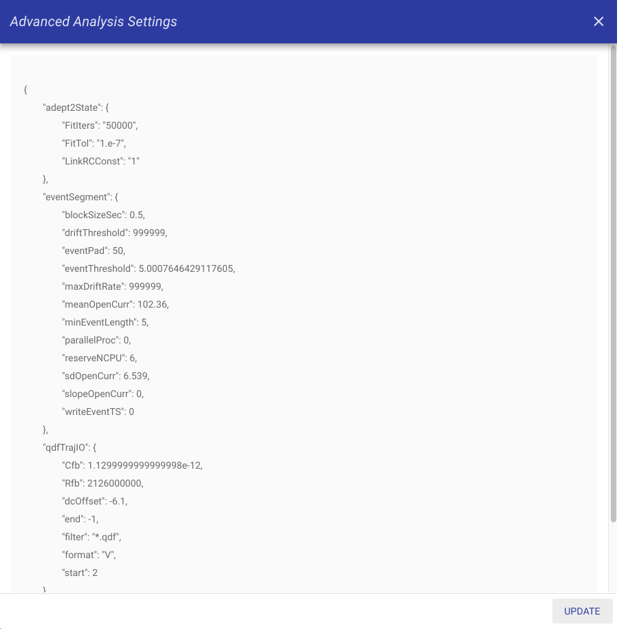
5. Advanced Settings
This opens a dialog window to manually edit settings not otherwise accessible in the GUI. See the Settings File section for further details.
6. Start Analysis/Update Settings
Use this button to either start the analysis when it has a Play symbol or to update and validate any settings when it displays a Check Mark.
5.4. Analysis Results
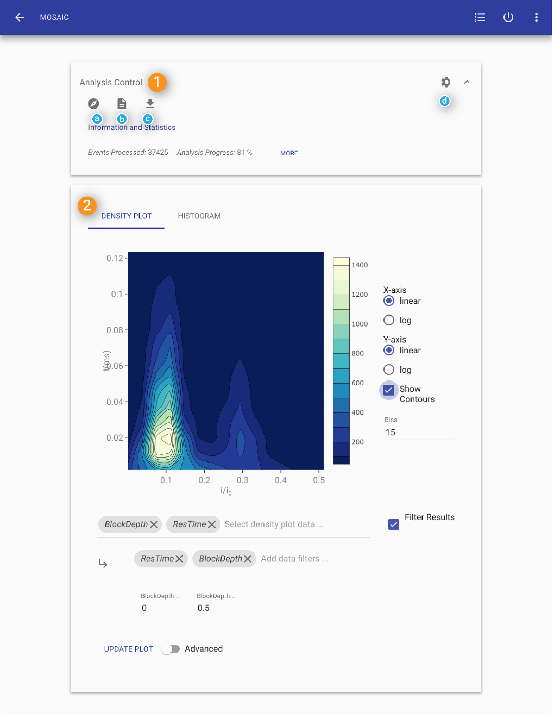
1. Analysis Control
Statistics
The Statistics Window is displayed when a new analysis is started and displays:
Events Processed: The number of events processed.
Processing Error: The processing error rate (i.e. the percentage of events for which fit has failed).
Capture Rate: An estimate of the mean capture rate.
Analysis Time: The amount of data processed (in seconds).
2. Results View
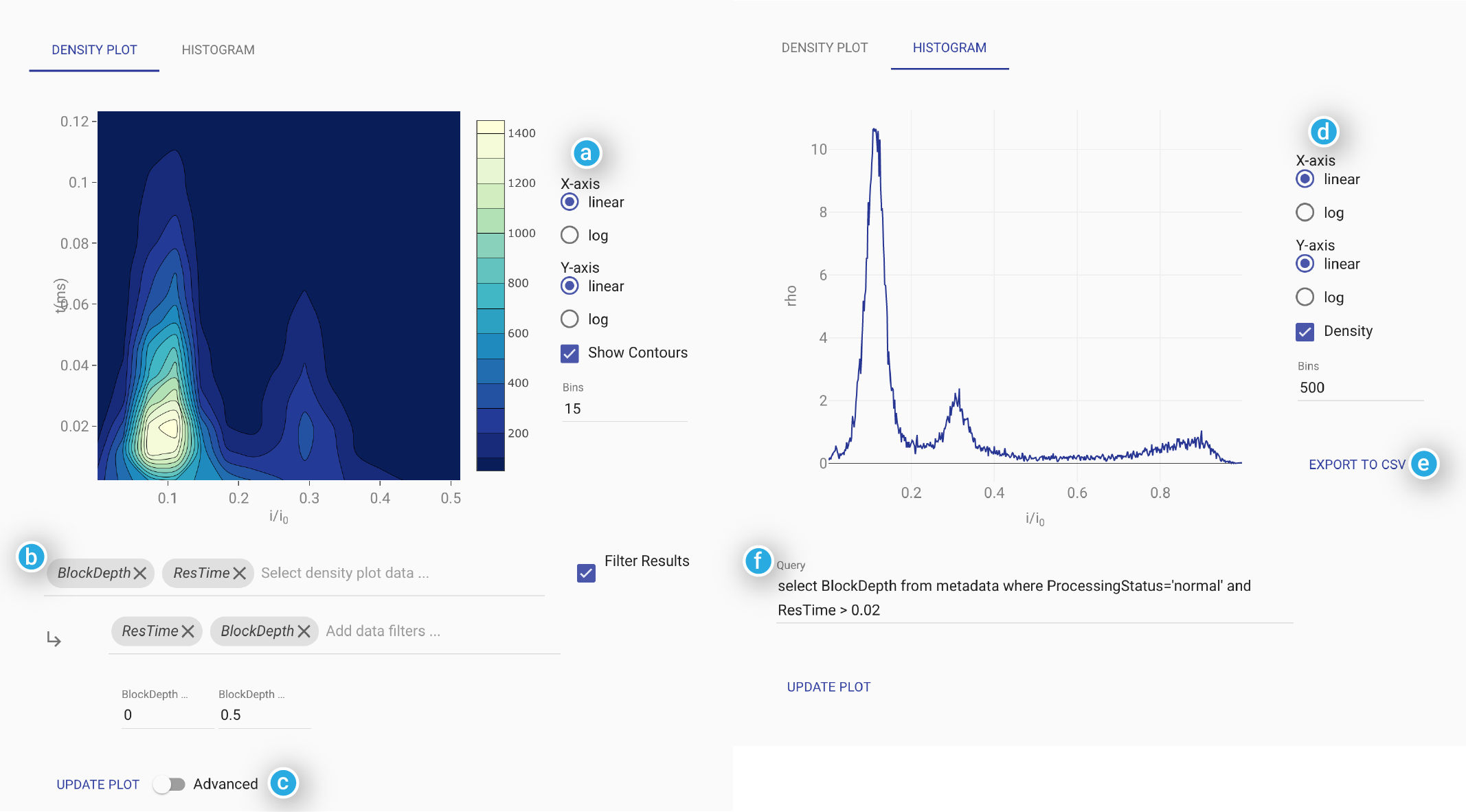
This window shows the blockade depth histogram calculated from the meta-data output by MOSAIC.
Filter: The data displayed in the histogram can be restricted to events that fulfill specific user-defined criteria. For instance, the default filter
ResTime > 0.025only includes events longer than 0.025 ms (or 25 \(\mu s\)). The GUI uses a SQL select statement to restrict the events included in the histogram. The text in the Filter field represents the part of the query after the where clause, and allows the user to use standard SQL syntax to narrow the results in the plot. See the Work with SQLite section for details on SQL syntax.Bins: The number of bins in the histogram are defined here. By default, 500 bins are used, but the user can change this necessary.
Detect Peaks: Checking Detect Peaks enables a wavelet-based peak detection algorithm. The wavelet level slider controls the sensitivity of the peak detection. Sliding it to the right will decrease the number of peaks picked up. The peaks detected are represented with red dots. Mousing over the detected peaks cause the coordinates of the peak to be displayed in the lower right hand corner of the window. The detected peaks can also be exported to a CSV file from the file menu
File>Save Histogram.