Data from the net-zero house includes 400+ variables that include readings from instrumentation around the house in one minute increments. Each of these variables, also called channels in NIST documentation, provides the readings from one instrument, and the instruments are grouped into subsystems:
This tutorial walks through loading data from a particular subsystem.
If you want to analyze net-zero data for specific subsystems, rather than data for the whole house, you can download the data from the net-zero website and import it into R, or you can use the download link directly.
For example, if you wanted to analyze the channels (like the heat pump air flow rate or the total power used by the heat pump) in the HVAC subsystem, you could pull data for that subsystem:
# load libraries
library(ggplot2) # plotting library

# get data
hvac <- read.csv("https://s3.amazonaws.com/nist-netzero/2015-data-files/HVAC-minute.csv", header=TRUE, na.strings=c("NA", "NULL", "", " "))
Here are the variables included in the HVAC subsystem data. The nomenclature includes the name of the subsystem and the name of the channel as SubSystem_Channel.
names(hvac)
##  [1] "Timestamp"
##  [2] "TimeStamp_Count"
##  [3] "TimeStamp_SchedulerTime"
##  [4] "TimeStamp_SystemTime"
##  [5] "DayOfWeek"
##  [6] "HVAC_HVACDeltaPPressureDiffacrossIndoorUnit"
##  [7] "HVAC_HVACDewpointReturnAir"
##  [8] "HVAC_HVACDewpointSupplyAir"
##  [9] "HVAC_HVACTempReturnAir"
## [10] "HVAC_HVACTempSupplyAir"
## [11] "HVAC_HeatPumpIndoorEnergyTotal"
## [12] "HVAC_HeatPumpIndoorPowerTotal"
## [13] "HVAC_HeatPumpOutdoorEnergyTotal"
## [14] "HVAC_HeatPumpOutdoorPowerTotal"
## [15] "HVAC_HeatPumpEnergyIndoorunit"
## [16] "HVAC_HeatPumpEnergyOutdoorUnit"
## [17] "HVAC_X1421IDUnitPowerDemandW"
## [18] "HVAC_X1422ODUnitPowerDemandW"
## [19] "HVAC_X1423UltraAire70HPowerW"
## [20] "HVAC_UltraAire70HInletAirAvgTempF"
## [21] "HVAC_UltraAire70HExitAirAvgTempF"
## [22] "HVAC_UltraAire70HAirflowCFM"
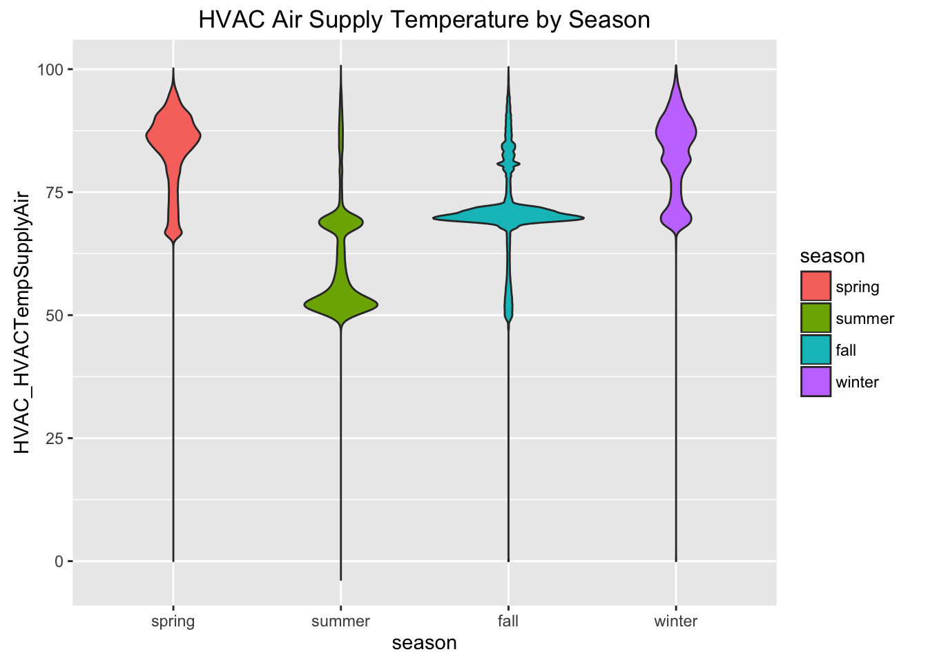
Once you have your data, you can visualize the Supply and Return air temperatures by season.
First, convert Timestamp into a date/time format using strptime():
# converts Timestamp variable into date/time format (POSIXlt)
hvac$Timestamp <- strptime(hvac$Timestamp, "%Y-%m-%d %H:%M:%S")

# quick check of the values in the Timestamp variable
hvac$Timestamp[1:10]
##  [1] "2015-02-01 00:00:00 EST" "2015-02-01 00:01:00 EST"
##  [3] "2015-02-01 00:02:00 EST" "2015-02-01 00:03:00 EST"
##  [5] "2015-02-01 00:04:00 EST" "2015-02-01 00:05:00 EST"
##  [7] "2015-02-01 00:06:00 EST" "2015-02-01 00:07:00 EST"
##  [9] "2015-02-01 00:08:00 EST" "2015-02-01 00:09:00 EST"
Now we can use the Timestamp variable to create a new categorical 'season' variable:
# create a variable for seasons
hvac$season <- "summer"
hvac$season[hvac$Timestamp < '2015-03-20 12:30:00'] <- "spring"
hvac$season[hvac$Timestamp > '2015-09-22 10:21:00' & hvac$Timestamp < '2015-12-21 05:44:00'] <- "fall"
hvac$season[hvac$Timestamp > '2015-12-21 05:44:00'] <- "winter"
hvac$season <- ordered(hvac$season, levels = c("spring", "summer", "fall", "winter"))

# now we can do things like group readings by season
ggplot(hvac, aes(x = season, y = HVAC_HVACTempSupplyAir, fill = season)) +
  geom_violin(scale = "area") +
  ggtitle("HVAC Air Supply Temperature by Season")
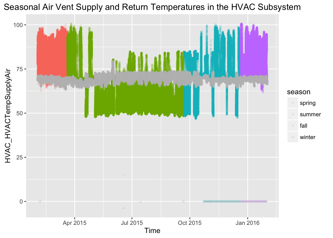
Additionally, we can compare readings between channels in the subsystem; this compares the air temperature in the HVAC supply air with the retun air:
# Visualize supply and return air temperature
ggplot(hvac, aes(x = Timestamp)) +
  geom_point(aes(y = HVAC_HVACTempSupplyAir, colour = season), alpha = 0.10, size = 1) +
  geom_point(aes(y = HVAC_HVACTempReturnAir), colour = "grey", alpha = 0.10, size = 1) +
  xlab("Time") +
  ggtitle("Seasonal Air Vent Supply and Return Temperatures in the HVAC Subsystem")
The net-zero data also includes a few date/time variables like Timestamp, which is the date and timestamp for each reading, DayOfWeek and TimeStampCount.
This tutorial walks through filtering data based on time of day, and comparing channel readings by day of the week.
If you want to analyze net-zero data for specific subsystems, rather than data for the whole house, you can download the data from the net-zero data portal and import it into R, or you can use the download link directly like we did below.
In order to analyze data from channels (i.e. instrumentation data) in the Electrical subsystem, we can import the data using read.csv():
# load libraries
library(ggplot2) # plotting library

# get data
elec <- read.csv("https://s3.amazonaws.com/nist-netzero/2015-data-files/Elec-minute.csv", header=TRUE, na.strings=c("NA", "NULL", "", " "))
There are 144 variables in the Electrical subsystem, here are the first 20 variables. The nomenclature includes the name of the subsystem and the name of the channel as SubSystem_Channel.
names(elec)[1:20]
##  [1] "Timestamp"
##  [2] "TimeStamp_Count"
##  [3] "TimeStamp_SchedulerTime"
##  [4] "TimeStamp_SystemTime"
##  [5] "DayOfWeek"
##  [6] "Elec_EnergyRPB1PlugsBaseAHeliodyneHXs"
##  [7] "Elec_EnergyRPB13PlugsDR"
##  [8] "Elec_EnergyRPB14PlugsBR4"
##  [9] "Elec_EnergyRPB15PlugsEntryHall"
## [10] "Elec_EnergyRPB16PlugsLR"
## [11] "Elec_EnergyRPB17ClothesWasher"
## [12] "Elec_EnergyRPB18Dryer1of2"
## [13] "Elec_EnergyRPB19Dehumidifier"
## [14] "Elec_EnergyRPB2PlugsBaseB"
## [15] "Elec_EnergyRPB20Dryer2of2"
## [16] "Elec_EnergyRPB21HeatPump1of2"
## [17] "Elec_EnergyRPB22AHU21of2"
## [18] "Elec_EnergyRPB23HeatPump2of2"
## [19] "Elec_EnergyRPB24AHU22of2"
## [20] "Elec_EnergyRPB25HRV"
Before we can visualize this data by date or time, we need to convert Timestamp into a date/time format using strptime().
# converts Timestamp variable into date/time format (POSIXlt)
elec$Timestamp <- strptime(elec$Timestamp, "%Y-%m-%d %H:%M:%S")
Here is a sample of what that looks like:
elec$Timestamp[1:10]
##  [1] "2015-02-01 00:00:00 EST" "2015-02-01 00:01:00 EST"
##  [3] "2015-02-01 00:02:00 EST" "2015-02-01 00:03:00 EST"
##  [5] "2015-02-01 00:04:00 EST" "2015-02-01 00:05:00 EST"
##  [7] "2015-02-01 00:06:00 EST" "2015-02-01 00:07:00 EST"
##  [9] "2015-02-01 00:08:00 EST" "2015-02-01 00:09:00 EST"
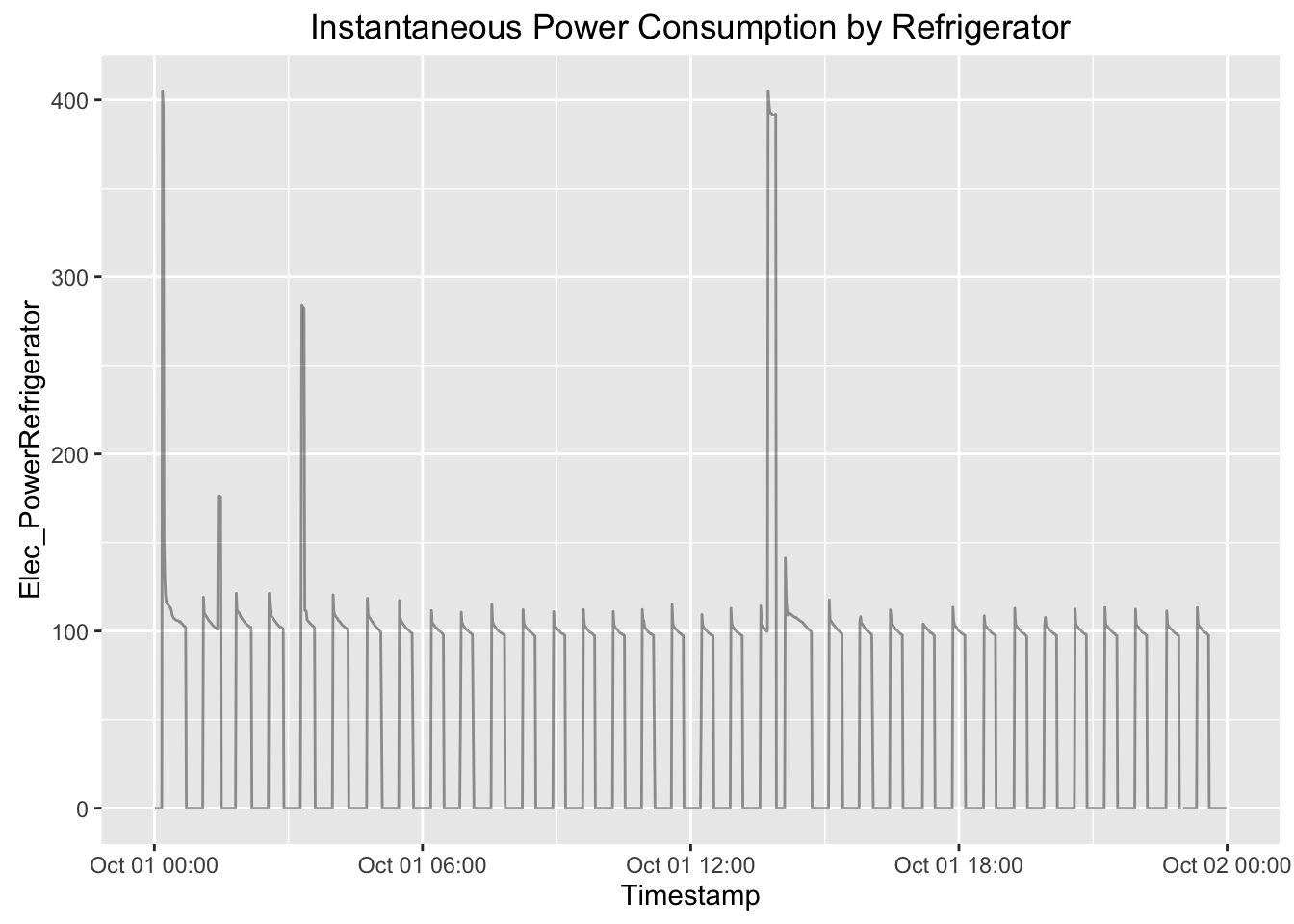
Now we can choose a random day and look at what the refrigerator readings looked like by filtering our data using on Timestamp and using the Elec_PowerRefrigerator variable.
ggplot(elec[elec$Timestamp < '2015-10-02 00:00:00' & elec$Timestamp > '2015-10-01 00:00:00',], aes(x = Timestamp, y = Elec_PowerRefrigerator)) +
  geom_line(alpha = 0.4) +
  ggtitle("Instantaneous Power Consumption by Refrigerator")
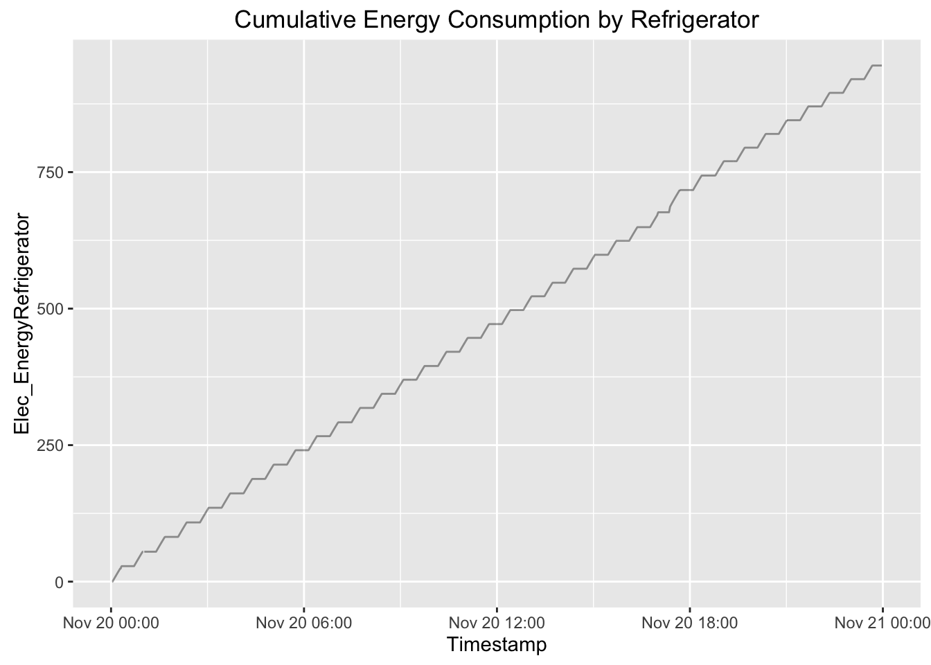
Alternatively, to look at the cumulative energy consumption for that day (which resets once a day), we could visualize the Elec_EnergyRefrigerator variable.
ggplot(elec[elec$Timestamp < '2015-10-02 00:00:00' & elec$Timestamp > '2015-10-01 00:00:00',], aes(x = Timestamp, y = Elec_EnergyRefrigerator)) +
  geom_line(alpha = 0.4) +
  ggtitle("Cumulative Energy Consumption by Refrigerator")
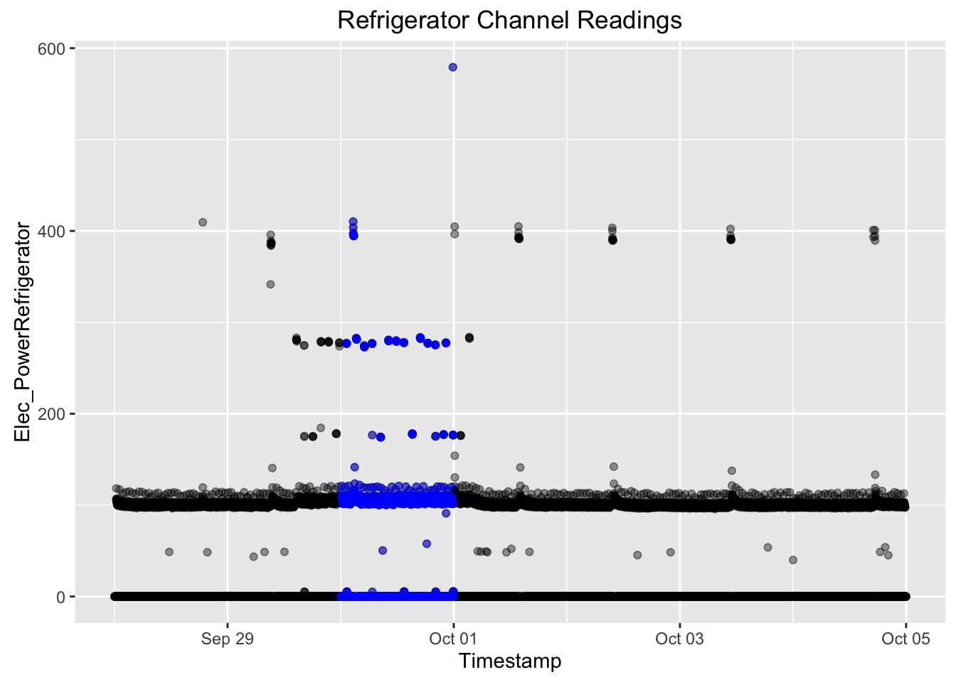
Visualizing instaneous power consumption by the refrigerator for that day in comparison to the rest of the week would allow us to see any spikes in power consumption.
ggplot(elec[elec$Timestamp < '2015-10-05 00:00:00' & elec$Timestamp > '2015-09-28 00:00:00',], aes(x = Timestamp , y = Elec_PowerRefrigerator)) +
  geom_point(alpha = 0.4) +
  geom_point(data = elec[elec$Timestamp < '2015-10-01 00:00:00' & elec$Timestamp > '2015-09-30 00:00:00',], alpha = 0.4, color = "blue") +
  ggtitle("Refrigerator Channel Readings")
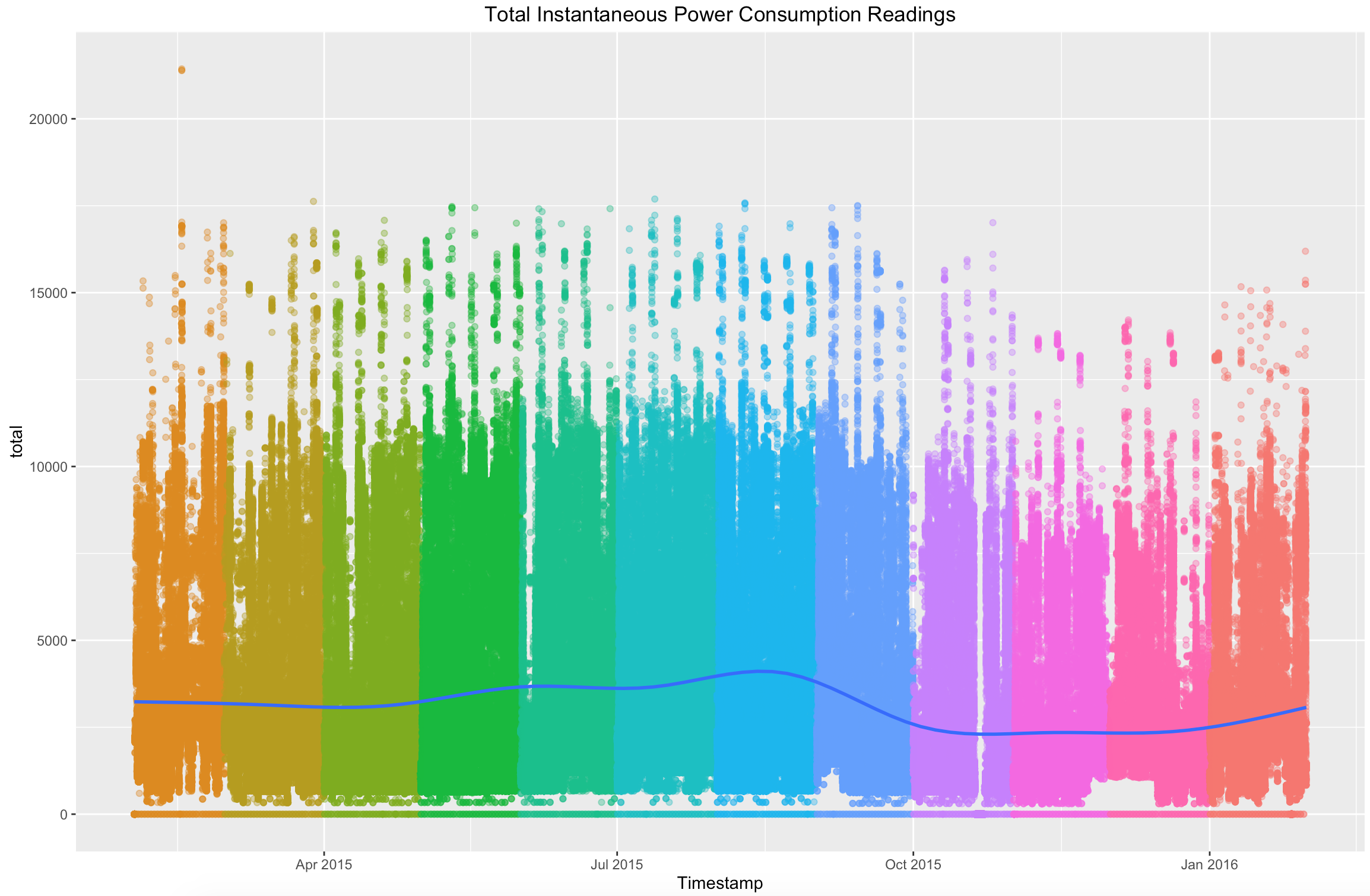
Channels provide data at the instrumentation-level, however it is possible to analyze aggregate readings at the subsystem level.
This tutorial walks through analyzing aggregate/total instantaneous readings for channels in the Electrical subsystem
First, we can use the download link from the Data page to import the data for the Electrical Subsystem:
# load libraries
library(ggplot2) # plotting library
library(reshape2) # library for reshaping data easily

# get data
elec <- read.csv("https://s3.amazonaws.com/nist-netzero/2015-data-files/Elec-minute.csv", header=TRUE, na.strings=c("NA", "NULL", "", " "))
There are 158 channels in the Electrical subsystem, however it is possible to aggregate those instantaneous power consumption readings.
# Row and column count for Electrical channel data
dim(elec)
## [1] 524161 163
# create an object that only has instantaneous power readings
elec_power <- elec[,c("Timestamp", names(elec)[grep("_Power", names(elec))])]

# using the data dictionary or metadata files, this object could be narrowed down to power consumption in one room or for a specific appliance
# the 'total' variable below is a sum of all electrical power consumption channels
elec_power$total <- rowSums(elec_power[,2:ncol(elec_power)])

# ggplot(elec_power[,c("Timestamp", "total")], aes(x = Timestamp, y = total)) +
   geom_point(aes(colour = strftime(elec_power$Timestamp, format = "%m")), alpha = 0.4) +
   geom_smooth() +
   theme(legend.position="none") +
   ggtitle("Total Instantaneous Power Consumption Readings")
When you download the files from the Download table it will be as a CSV file. If you are interested in building a project using JavaScript, NodeJS, or anything that is more suited to JSON file structures - you will need to covert them from CSVs to JSON. In our work we have recommended using the CSVtoJSON Converter module that you can download from npm. Once you have downloaded the npm module you can use the following code as a template to convert the raw CSV to a JSON file. (We do not recommend this tutorial for converting the 'All Subsystems' CSV file because of its size).
var Converter = require('csvtojson').Converter;
var converter = new Converter({
    constructResult: false, ## if you are using a large file it does not hold the data to memory
    toArrayString: true ## pipes the data to an array
});

var readStream = require('fs').createReadStream('../All-Subsystems-minute.csv'); ## relative path to where the downloaded CSV is in your repo
var writeStream = require('fs').createWriteStream('../output.json'); ## relative path to where you would like the JSON file to be made

readStream.pipe(converter).pipe(writeStream);
Please see the documentation (link) for all options that are available to you. In addition, if you are curious about File Streams in Node feel free to take a look at its documentation as well.