Plotting Tutorial#
This tutorial demonstrates how to use the plotting capabilities of the AFL.double_agent package to visualize compositional and scattering data.
Introduction#
The AFL.double_agent.plotting module provides a variety of plotting functions for visualizing materials data. It supports:
Compositional data visualization (scatter and surface plots)
Small-angle scattering data visualization
Both 2D and 3D plots
Ternary plots for three-component systems
Multiple backends (Matplotlib and Plotly)
In this tutorial, we’ll explore these capabilities using example datasets.
Google Colab Setup#
Only uncomment and run the next cell if you are running this notebook in Google Colab or if don’t already have the AFL-agent package installed.
[ ]:
# !pip install git+https://github.com/usnistgov/AFL-agent.git
General Setup#
First, let’s import the necessary modules and load our example dataset:
[1]:
import numpy as np
import matplotlib.pyplot as plt
import xarray as xr

# Import the plotting module
from AFL.double_agent.plotting import plot, plot_scatter_mpl, plot_surface_mpl, plot_sas_mpl
from AFL.double_agent.plotting import plot_scatter_plotly, plot_surface_plotly, plot_sas_plotly

# Load the example dataset
from AFL.double_agent.data import example_dataset1

import plotly.io as pio
pio.renderers.default = "iframe_connected"
# pio.renderers.default = "plotly_mimetype"

# Load the dataset
ds = example_dataset1()

# Display the dataset structure
ds
[1]:
<xarray.Dataset> Size: 164kB
Dimensions:              (sample: 100, component: 2, x: 150, grid: 2500)
Coordinates:
  * component            (component) <U1 8B 'A' 'B'
  * x                    (x) float64 1kB 0.001 0.001047 0.001097 ... 0.9547 1.0
Dimensions without coordinates: sample, grid
Data variables:
    composition          (sample, component) float64 2kB ...
    ground_truth_labels  (sample) int64 800B ...
    measurement          (sample, x) float64 120kB ...
composition_grid (grid, component) float64 40kB ...The example dataset contains compositional data and measurements that we can use for our plots.
Compositional Data Visualization#
Scatter Plots#
Let’s start with a simple scatter plot of our compositional data using Matplotlib:
[2]:
# Create a scatter plot using Matplotlib
plt.figure(figsize=(8, 6))
artists = plot_scatter_mpl(
    dataset=ds,
    component_variable='composition',
    labels='ground_truth_labels',
    discrete_labels=True
)
plt.title('Composition Scatter Plot (Matplotlib)')
plt.show()
<Figure size 800x600 with 0 Axes>

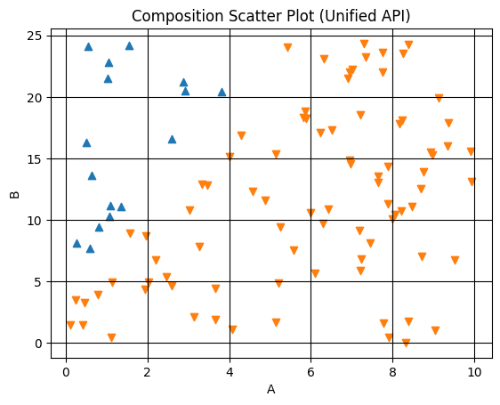
We can also create the same plot using the unified plot function:
[3]:
# Create a scatter plot using the unified plot function
plt.figure(figsize=(8, 6))
artists = plot(
    dataset=ds,
    kind='scatter',
    backend='mpl',
    component_variable='composition',
    labels='ground_truth_labels',
    discrete_labels=True
)
plt.title('Composition Scatter Plot (Unified API)')
plt.show()
<Figure size 800x600 with 0 Axes>
Now, let’s create an interactive scatter plot using Plotly.
[4]:
# Create a scatter plot using Plotly
fig = plot_scatter_plotly(
    dataset=ds,
    component_variable='composition',
    labels='ground_truth_labels',
    discrete_labels=True
)
fig.update_layout(title='Composition Scatter Plot (Plotly)')
fig.show()
Surface Plots#
Surface plots are useful for visualizing continuous fields over compositional space:
[5]:
# Create a surface plot using Matplotlib
plt.figure(figsize=(8, 6))
artists = plot_surface_mpl(
    dataset=ds,
    component_variable='composition',
    labels='ground_truth_labels'
)
plt.colorbar(artists)
plt.title('Composition Surface Plot (Matplotlib)')
plt.show()
<Figure size 800x600 with 0 Axes>
And with Plotly:
[6]:
# Create a surface plot using Plotly
fig = plot_surface_plotly(
    dataset=ds,
    component_variable='composition',
    labels='ground_truth_labels'
)
fig.update_layout(title='Composition Surface Plot (Plotly)')
fig.show()
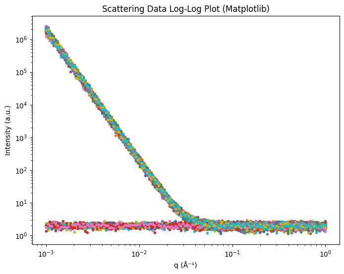
Small-Angle Scattering Data Visualization#
The measurement variable in our dataset can be treated as scattering data for demonstration purposes.
Log-Log Plots#
Log-log plots are commonly used for scattering data:
[7]:
# Create a log-log plot using Matplotlib
plt.figure(figsize=(8, 6))
artists = plot_sas_mpl(
    dataset=ds,
    plot_type='loglog',
    x='x',
    y='measurement',
    xlabel='q (Å⁻¹)',
    ylabel='Intensity (a.u.)',
    legend=False,
)
plt.title('Scattering Data Log-Log Plot (Matplotlib)')
plt.show()
And with Plotly:
[8]:
# Create a log-log plot using Plotly
fig = plot_sas_plotly(
    dataset=ds,
    plot_type='loglog',
    x='x',
    y='measurement',
    xlabel='q (Å⁻¹)',
    ylabel='Intensity (a.u.)'
)
fig.update_layout(title='Scattering Data Log-Log Plot (Plotly)')
fig.show()
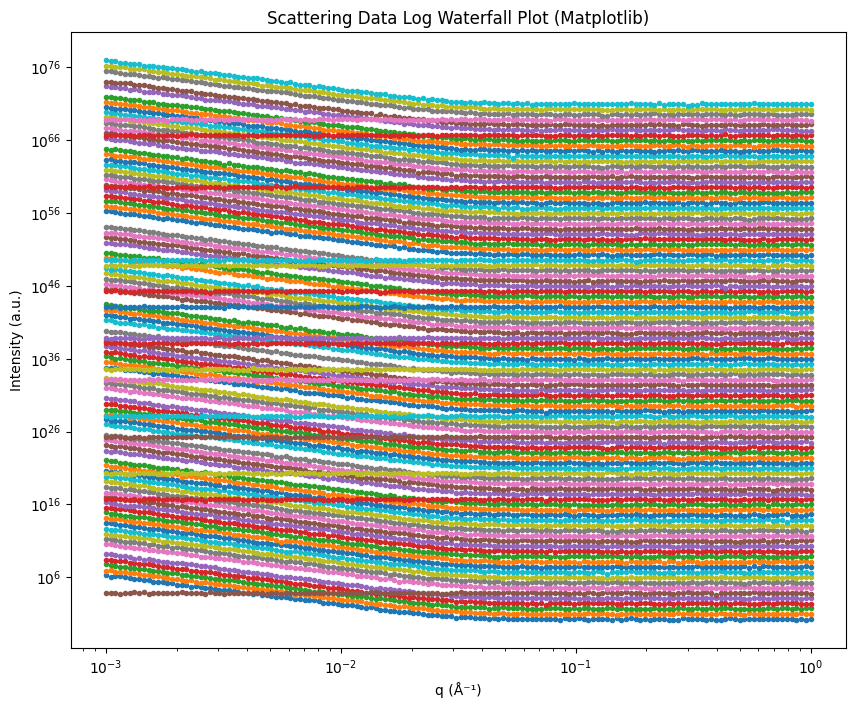
Waterfall Plots#
Waterfall plots are useful for comparing multiple scattering curves:
[9]:
# Create a log waterfall plot using Matplotlib
plt.figure(figsize=(10, 8))
artists = plot_sas_mpl(
    dataset=ds,
    plot_type='logwaterfall',
    x='x',
    y='measurement',
    xlabel='q (Å⁻¹)',
    ylabel='Intensity (a.u.)',
    base=5, # Separation factor between curves
    legend=False,
)
plt.title('Scattering Data Log Waterfall Plot (Matplotlib)')
plt.show()
And with Plotly:
[10]:
# Create a log waterfall plot using Plotly
fig = plot_sas_plotly(
    dataset=ds,
    plot_type='logwaterfall',
    x='x',
    y='measurement',
    xlabel='q (Å⁻¹)',
    ylabel='Intensity (a.u.)',
    base=5  # Separation factor between curves
)
fig.update_layout(title='Scattering Data Log Waterfall Plot (Plotly)')
fig.show()
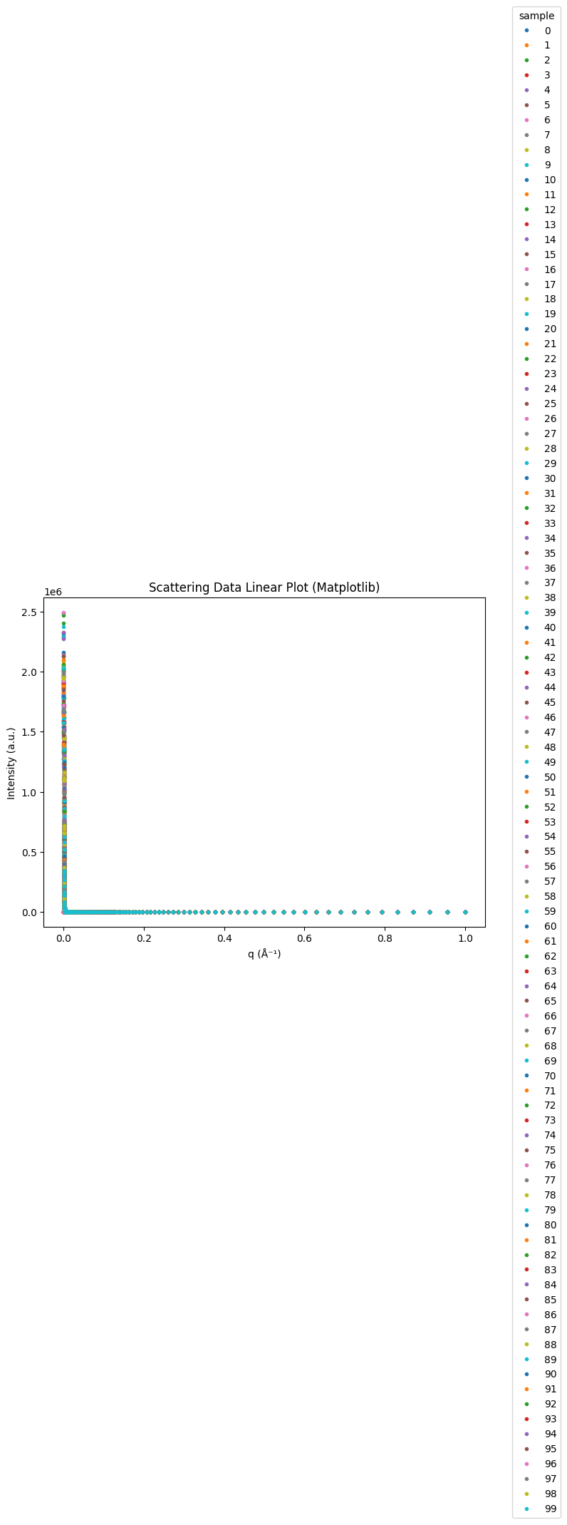
Linear Plots#
For some data, linear plots might be more appropriate. This is often used when the data has been log-scaled already.
[32]:
# Create a linear plot using Matplotlib

plt.figure(figsize=(8, 6))
artists = plot_sas_mpl(
    dataset=ds,
    plot_type='linlin',
    x='x',
    y='measurement',
    xlabel='q (Å⁻¹)',
    ylabel='Intensity (a.u.)'
)
plt.title('Scattering Data Linear Plot (Matplotlib)')
plt.show()
Advanced Features#
3D Plots for Three-Component Systems#
For three-component systems, we can create 3D plots:
[33]:
# Create a synthetic three-component dataset
n_samples = 100
components = np.random.random((n_samples, 3))
# Normalize to sum to 1
components = components / components.sum(axis=1, keepdims=True)

# Create labels
labels = np.zeros(n_samples)
labels[components[:, 0] > 0.6] = 1
labels[components[:, 1] > 0.6] = 2

# Create the dataset
three_comp_ds = xr.Dataset(
    data_vars={
        'compositions': (['sample', 'component'], components)
    },
    coords={
        'component': ['A', 'B', 'C'],
        'labels': (['sample'], labels)
    }
)

# Create a 3D scatter plot (non-ternary)
fig = plot_scatter_plotly(
    dataset=three_comp_ds,
    component_variable='compositions',
    labels='labels',
    discrete_labels=True,
    ternary=False  # Use 3D Cartesian plot instead of ternary
)
fig.update_layout(title='Three-Component Scatter Plot (3D)')
fig.show()
Ternary Plots#
For three-component systems, ternary plots are often more intuitive:
[34]:
fig = plot_scatter_plotly(
    dataset=three_comp_ds,
    component_variable='compositions',
    labels='labels',
    discrete_labels=True,
    ternary=True  # Use ternary plot
)
fig.update_layout(title='Three-Component Scatter Plot (Ternary)')
fig.show()
Conclusion#
In this tutorial, we’ve explored the plotting capabilities of the AFL.double_agent package. We’ve seen how to:
Create scatter and surface plots for compositional data
Visualize small-angle scattering data with various plot types
Work with both 2D and 3D plots
Create ternary plots for three-component systems
Use both Matplotlib and Plotly backends
Customize plots to suit specific needs
The unified plot function provides a convenient interface to all these capabilities, making it easy to switch between plot types and backends.
For more details on the available plotting functions and their parameters, refer to the API documentation.