![]()
Building Pipelines#
Here we’ll go into more detail on the Quick Start Example from Getting Started. In this example, we’ll build a pipeline that
standardized the input compositions to improve the convergence of the Gaussian Process optimization
uses a Savitzky-Golay filter to compute the first derivative of the measurement
computes the similarity between the derivatives of the measurement data
clusters (i.e., labels) the data using spectral clustering
fits a Gaussian Process classifier to the data.
chooses the next optimal measurement based on the entropy of the Gaussian Process posterior
Setup#
Only uncomment and run the next cell if you are running this notebook in Google Colab or if don’t already have the AFL-agent package installed.
[ ]:
# !pip install git+https://github.com/usnistgov/AFL-agent.git
Below are the imported modules used in this tutorial
[1]:
import numpy as np
import xarray as xr
import matplotlib.pyplot as plt

from AFL.double_agent import *
from AFL.double_agent.plotting import *
Load Input Data#
Okay, to begin, we’ll load in a pre-prepared xarray.Dataset. These are powerful and flexible data structures for working with multi-dimensional data, and AFL.double_agent uses them for all input, intermediate and output data.
The dataset below contains simulated measurement data along with the compositions that this simulated data was generated at. It also has the ground truth phase labelse along with a grid of compositions that the agent will search through for the next optimal measurement.
To see how this dataset is created, see Building xarray.Datasets page.
[2]:
ds = xr.load_dataset('../data/example_dataset.nc')
ds
[2]:
<xarray.Dataset> Size: 164kB
Dimensions:              (sample: 100, component: 2, x: 150, grid: 2500)
Coordinates:
  * component            (component) <U1 8B 'A' 'B'
  * x                    (x) float64 1kB 0.001 0.001047 0.001097 ... 0.9547 1.0
Dimensions without coordinates: sample, grid
Data variables:
    composition          (sample, component) float64 2kB 5.7 1.36 ... 5.104
    ground_truth_labels  (sample) int64 800B 1 1 0 1 0 1 1 1 ... 1 1 1 1 1 0 1 1
    measurement          (sample, x) float64 120kB 1.915e+06 1.479e+06 ... 1.885
composition_grid (grid, component) float64 40kB 0.0 0.0 ... 10.0 25.0Note how, in the second column of the table,the dimension names of each variable is listed. This is a foundational feature of all xarray data structure and underlys how they error check and align operations.
Step 1: Composition Preprocessing#
Many machine learning and optimization algorithms show better performance when their input data is normalized or standardized (i.e., the data is rescaled so that the mean and standard deviation is small).
To start, we’ll add Pipeline operations that normalize the composition and composition_grid data variables.
We’ll do this using the Pipeline context manager (i.e., the with construct shown below). Using this approach, each Pipeline operation that is defined in the context is automatically added to the my_first_pipeline variable.
[3]:
from AFL.double_agent import *

with Pipeline() as my_first_pipeline:
    Standardize(
        input_variable='composition',
        output_variable='normalized_composition',
        dim='sample',
        component_dim='component',
        min_val={'A':0.0,'B':0.0},
        max_val={'A':10.0,'B':25.0},
    )

my_first_pipeline
[3]:
<Pipeline Pipeline N=1>
Going over the arguments to Standardize one by one:
input_variable='composition': The data variable to normalize, in this case the ‘composition’ variable`output_variable=’normalized_composition’: The name of the new variable that will store the normalized data
dim='sample': The dimension along which to compute statistics for normalizationcomponent_dim='component': The dimension containing different components/featuresmin_val={'A':0.0,'B':0.0}: Dictionary specifying minimum values for each componentmax_val={'A':10.0,'B':25.0}: Dictionary specifying maximum values for each component
We can view more information about the pipeline by printing it
[4]:
my_first_pipeline.print()
PipelineOp                               input_variable ---> output_variable
----------                               -----------------------------------
0  ) <Standardize>                       composition ---> normalized_composition

Input Variables
---------------
0) composition

Output Variables
----------------
0) normalized_composition
You can add more operations to the Pipeline by recreating the context
[5]:
with my_first_pipeline:
    Standardize(
        input_variable='composition_grid',
        output_variable='normalized_composition_grid',
        dim='grid',
        component_dim='component',
        min_val={'A':0.0,'B':0.0},
        max_val={'A':10.0,'B':25.0},
    )

my_first_pipeline.print()
PipelineOp                               input_variable ---> output_variable
----------                               -----------------------------------
0  ) <Standardize>                       composition ---> normalized_composition
1  ) <Standardize>                       composition_grid ---> normalized_composition_grid

Input Variables
---------------
0) composition
1) composition_grid

Output Variables
----------------
0) normalized_composition
1) normalized_composition_grid
We can run the pipeline by calling the .calculate method and passing in the input dataset ds
[6]:
ds_result = my_first_pipeline.calculate(ds);
ds_result
[6]:
<xarray.Dataset> Size: 205kB
Dimensions:                      (sample: 100, component: 2, x: 150, grid: 2500)
Coordinates:
  * component                    (component) <U1 8B 'A' 'B'
  * x                            (x) float64 1kB 0.001 0.001047 ... 0.9547 1.0
Dimensions without coordinates: sample, grid
Data variables:
    composition                  (sample, component) float64 2kB 5.7 ... 5.104
    ground_truth_labels          (sample) int64 800B 1 1 0 1 0 1 ... 1 1 1 0 1 1
    measurement                  (sample, x) float64 120kB 1.915e+06 ... 1.885
    composition_grid             (grid, component) float64 40kB 0.0 0.0 ... 25.0
    normalized_composition       (sample, component) float64 2kB 0.57 ... 0.2042
normalized_composition_grid (grid, component) float64 40kB 0.0 0.0 ... 1.0Note that the output dataset ds_result contains not only all of the data from ds but also two new variables that were produced by the pipeline operations that we added: normalized composition and normalized_composition_grid.
We can visualise the results of the normalization by plotting the composition and normalized_composition variables side-by-side. We’ll do this by using the plot_scatter_mpl helper function from AFL.double_agent.plotting.
[7]:
fig,axes = plt.subplots(1,2,figsize=(8,3.25))

plot_scatter_mpl(ds_result,'composition',component_dim='component',labels='ground_truth_labels',ax=axes[0])
axes[0].set(title='Raw Composition Data')

plot_scatter_mpl(ds_result,'normalized_composition',component_dim='component',labels='ground_truth_labels',ax=axes[1])
axes[1].set(title='Normalized Composition Data')
[7]:
[Text(0.5, 1.0, 'Normalized Composition Data')]
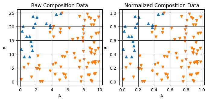
Note that the relative data positions are unchanged, only the magnitude of the axes is changed.
Step 2: Savitsky-Golay Filter#
Now that we have the composition data processed, we can move on to processing the measurement data. In many cases, smoothing and filtering data can help remove noise and emphasize features in data that you want your agent to focus on.
Here we’ll add a SavgolFilter operation in order to calculate the first derivative of the measurement data.
[8]:
with my_first_pipeline:

       SavgolFilter(
           input_variable='measurement',
           output_variable='derivative',
           dim='x',
           window_length=50,
           apply_log_scale=True,
           derivative=1,

           )

my_first_pipeline.print()
PipelineOp                               input_variable ---> output_variable
----------                               -----------------------------------
0  ) <Standardize>                       composition ---> normalized_composition
1  ) <Standardize>                       composition_grid ---> normalized_composition_grid
2  ) <SavgolFilter>                      measurement ---> derivative

Input Variables
---------------
0) composition
1) composition_grid
2) measurement

Output Variables
----------------
0) normalized_composition
1) normalized_composition_grid
2) derivative
Let’s go through each argument passed to SavgolFilter:
input_variable='measurement': Specifies the data variable to filter, in this case the raw measurement dataoutput_variable='derivative': Names the new variable that will store the filtered/derivative datadim='x': Indicates which dimension to apply the filter along (the x-axis values)window_length=50: Sets the size of the moving window used for filtering - larger values give smoother resultsapply_log_scale=True: Takes the log of the x-axis values before filtering, useful for data spanning multiple orders of magnitudederivative=1: Calculates the first derivative of the data while filtering
We can run the pipeline on the dataset and plot the results.
[9]:
ds_result = my_first_pipeline.calculate(ds)
ds_result
[9]:
<xarray.Dataset> Size: 407kB
Dimensions:                      (sample: 100, component: 2, x: 150,
                                  grid: 2500, log_x: 250)
Coordinates:
  * component                    (component) <U1 8B 'A' 'B'
  * x                            (x) float64 1kB 0.001 0.001047 ... 0.9547 1.0
  * log_x                        (log_x) float64 2kB -3.0 -2.988 ... 0.0
Dimensions without coordinates: sample, grid
Data variables:
    composition                  (sample, component) float64 2kB 5.7 ... 5.104
    ground_truth_labels          (sample) int64 800B 1 1 0 1 0 1 ... 1 1 1 0 1 1
    measurement                  (sample, x) float64 120kB 1.915e+06 ... 1.885
    composition_grid             (grid, component) float64 40kB 0.0 0.0 ... 25.0
    normalized_composition       (sample, component) float64 2kB 0.57 ... 0.2042
    normalized_composition_grid  (grid, component) float64 40kB 0.0 0.0 ... 1.0
derivative (sample, log_x) float64 200kB -3.82 ... -0.4063Now we can plot the results of the Savgol filter
[10]:
fig,axes = plt.subplots(1,2,figsize=(8,3.25))

ds_result.measurement.plot.line(x='x',xscale='log',yscale='log',ax=axes[0],add_legend=False)
ds_result.derivative.plot.line(x='log_x',ax=axes[1],add_legend=False);

axes[0].set(title="Raw Data")
axes[1].set(title="Derivative of Smoothed Log(Data)")
[10]:
[Text(0.5, 1.0, 'Derivative of Smoothed Log(Data)')]
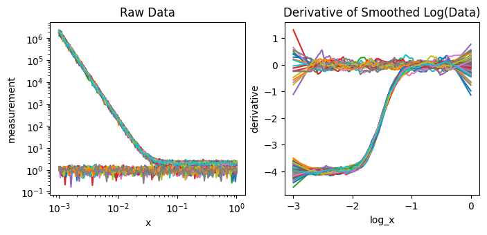
The data on the right has more flat, constant regions than the data on the left making it easier for the simlarity and clustering analyses below to separate.
Step 2: Calculate Similarity between Measurement Data#
Now that we have preprocessed our data using the Savgol filter, we can calculate the similarity between different measurements. The Similarity component computes a similarity matrix between all pairs of samples based on their filtered derivative data. This similarity matrix will be used as input for clustering in the next step.
[11]:
with my_first_pipeline:
    Similarity(
        input_variable='derivative',
        output_variable='similarity',
        sample_dim='sample',
        params={'metric': 'laplacian','gamma':1e-4}
        )

my_first_pipeline.print()
PipelineOp                               input_variable ---> output_variable
----------                               -----------------------------------
0  ) <Standardize>                       composition ---> normalized_composition
1  ) <Standardize>                       composition_grid ---> normalized_composition_grid
2  ) <SavgolFilter>                      measurement ---> derivative
3  ) <SimilarityMetric>                  derivative ---> similarity

Input Variables
---------------
0) composition
1) composition_grid
2) measurement

Output Variables
----------------
0) normalized_composition
1) normalized_composition_grid
2) similarity
The Similarity component takes the following inputs:
input_variable: The variable to calculate similarity between (‘derivative’)output_variable: The variable to store the similarity matrix (‘similarity’)sample_dim: The dimension containing different samples (‘sample’)params: Dictionary of parameters for similarity calculationmetric: The similarity metric to use (‘laplacian’)gamma: The scale parameter for the similarity metric (1e-4)
Let’s execute the pipeline
[12]:
ds_result = my_first_pipeline.calculate(ds)
ds_result
[12]:
<xarray.Dataset> Size: 487kB
Dimensions:                      (sample: 100, component: 2, x: 150,
                                  grid: 2500, log_x: 250, sample_i: 100,
                                  sample_j: 100)
Coordinates:
  * component                    (component) <U1 8B 'A' 'B'
  * x                            (x) float64 1kB 0.001 0.001047 ... 0.9547 1.0
  * log_x                        (log_x) float64 2kB -3.0 -2.988 ... 0.0
Dimensions without coordinates: sample, grid, sample_i, sample_j
Data variables:
    composition                  (sample, component) float64 2kB 5.7 ... 5.104
    ground_truth_labels          (sample) int64 800B 1 1 0 1 0 1 ... 1 1 1 0 1 1
    measurement                  (sample, x) float64 120kB 1.915e+06 ... 1.885
    composition_grid             (grid, component) float64 40kB 0.0 0.0 ... 25.0
    normalized_composition       (sample, component) float64 2kB 0.57 ... 0.2042
    normalized_composition_grid  (grid, component) float64 40kB 0.0 0.0 ... 1.0
    derivative                   (sample, log_x) float64 200kB -3.82 ... -0.4063
similarity (sample_i, sample_j) float64 80kB 1.0 ... 1.0We can visualize the similarity matrix.
[13]:
ds_result.similarity.plot()
[13]:
<matplotlib.collections.QuadMesh at 0x312e02690>
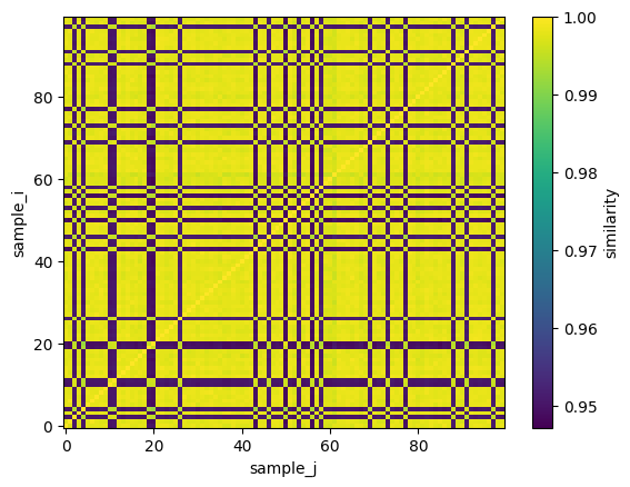
Each pixel indexed by (i,j) in this image corresponds to the similarity between measurement i and j. The bright pixels indicate high similarity and the darker pixels reduced similarity. A check on this calculation is that the diagonal should have a perfect similarity = 1.0 because each data is perfectly self similar to itself, i.e. S(i,i) = S(j,j) = 1.0
Step 3: Cluster Measurement Data based on Similarity#
Now that we can use the similarity matrix to cluster the data into groups.
[14]:
with my_first_pipeline:
    SpectralClustering(
        input_variable='similarity',
        output_variable='labels',
        dim='sample',
        params={'n_phases': 2}
        )


my_first_pipeline.print()
PipelineOp                               input_variable ---> output_variable
----------                               -----------------------------------
0  ) <Standardize>                       composition ---> normalized_composition
1  ) <Standardize>                       composition_grid ---> normalized_composition_grid
2  ) <SavgolFilter>                      measurement ---> derivative
3  ) <SimilarityMetric>                  derivative ---> similarity
4  ) <SpectralClustering>                similarity ---> labels

Input Variables
---------------
0) composition
1) composition_grid
2) measurement

Output Variables
----------------
0) normalized_composition
1) normalized_composition_grid
2) labels
The SpectralClustering pipeline operation takes:
input_variable: The similarity matrix to use for clustering (‘similarity’)output_variable: The variable to store the cluster labels (‘labels’)dim: The dimension containing different samples (‘sample’)params: Dictionary of parameters for clusteringn_phases: The number of clusters/phases to find (2)
Let’s run the pipeline with this new operation
[15]:
ds_result = my_first_pipeline.calculate(ds)
ds_result
[15]:
<xarray.Dataset> Size: 488kB
Dimensions:                      (sample: 100, component: 2, x: 150,
                                  grid: 2500, log_x: 250, sample_i: 100,
                                  sample_j: 100)
Coordinates:
  * component                    (component) <U1 8B 'A' 'B'
  * x                            (x) float64 1kB 0.001 0.001047 ... 0.9547 1.0
  * log_x                        (log_x) float64 2kB -3.0 -2.988 ... 0.0
Dimensions without coordinates: sample, grid, sample_i, sample_j
Data variables:
    composition                  (sample, component) float64 2kB 5.7 ... 5.104
    ground_truth_labels          (sample) int64 800B 1 1 0 1 0 1 ... 1 1 1 0 1 1
    measurement                  (sample, x) float64 120kB 1.915e+06 ... 1.885
    composition_grid             (grid, component) float64 40kB 0.0 0.0 ... 25.0
    normalized_composition       (sample, component) float64 2kB 0.57 ... 0.2042
    normalized_composition_grid  (grid, component) float64 40kB 0.0 0.0 ... 1.0
    derivative                   (sample, log_x) float64 200kB -3.82 ... -0.4063
    similarity                   (sample_i, sample_j) float64 80kB 1.0 ... 1.0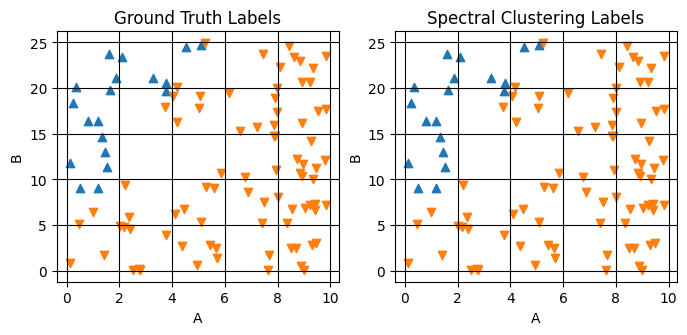
labels (sample) int64 800B 1 1 0 1 0 1 ... 1 1 1 0 1 1Plotting the results of this labeling and comparing to the ground truth
[16]:
fig,axes = plt.subplots(1,2,figsize=(8,3.25))

plot_scatter_mpl(ds_result,'composition',component_dim='component',labels='ground_truth_labels',ax=axes[0])
plot_scatter_mpl(ds_result,'composition',component_dim='component',labels='labels',ax=axes[1])

axes[0].set(title="Ground Truth Labels")
axes[1].set(title="Spectral Clustering Labels")
[16]:
[Text(0.5, 1.0, 'Spectral Clustering Labels')]
Step 4: Extrapolate Cluster Labels#
Now we can extrapolate the labels from the SpectralClustering over the composition_grid that we supplied in the input dataset.
[17]:
with my_first_pipeline:
    GaussianProcessClassifier(
        feature_input_variable='normalized_composition',
        predictor_input_variable='labels',
        output_prefix='extrap',
        sample_dim='sample',
        grid_variable='normalized_composition_grid',
        grid_dim='grid',
    )
my_first_pipeline.print()
PipelineOp                               input_variable ---> output_variable
----------                               -----------------------------------
0  ) <Standardize>                       composition ---> normalized_composition
1  ) <Standardize>                       composition_grid ---> normalized_composition_grid
2  ) <SavgolFilter>                      measurement ---> derivative
3  ) <SimilarityMetric>                  derivative ---> similarity
4  ) <SpectralClustering>                similarity ---> labels
5  ) <GaussianProcessClassifier>         ['normalized_composition', 'labels', 'normalized_composition_grid'] ---> ['extrap_mean', 'extrap_entropy']

Input Variables
---------------
0) composition
1) composition_grid
2) measurement

Output Variables
----------------
0) extrap_mean
1) extrap_entropy
The GaussianProcessClassifier pipeline operation takes:
feature_input_variable: The composition data to use for training (‘compositions’)predictor_input_variable: The labels to predict (‘labels’)output_prefix: Prefix for output variables (‘extrap’)sample_dim: The dimension containing different samples (‘sample’)grid_variable: The grid points to extrapolate to (‘composition_grid’)grid_dim: The dimension containing grid points (‘grid’)
[18]:
ds_result = my_first_pipeline.calculate(ds)
ds_result
[18]:
<xarray.Dataset> Size: 548kB
Dimensions:                      (sample: 100, component: 2, x: 150,
                                  grid: 2500, log_x: 250, sample_i: 100,
                                  sample_j: 100)
Coordinates:
  * component                    (component) <U1 8B 'A' 'B'
  * x                            (x) float64 1kB 0.001 0.001047 ... 0.9547 1.0
  * log_x                        (log_x) float64 2kB -3.0 -2.988 ... 0.0
Dimensions without coordinates: sample, grid, sample_i, sample_j
Data variables:
    composition                  (sample, component) float64 2kB 5.7 ... 5.104
    ground_truth_labels          (sample) int64 800B 1 1 0 1 0 1 ... 1 1 1 0 1 1
    measurement                  (sample, x) float64 120kB 1.915e+06 ... 1.885
    composition_grid             (grid, component) float64 40kB 0.0 0.0 ... 25.0
    normalized_composition       (sample, component) float64 2kB 0.57 ... 0.2042
    normalized_composition_grid  (grid, component) float64 40kB 0.0 0.0 ... 1.0
    derivative                   (sample, log_x) float64 200kB -3.82 ... -0.4063
    similarity                   (sample_i, sample_j) float64 80kB 1.0 ... 1.0
    labels                       (sample) int64 800B 1 1 0 1 0 1 ... 1 1 1 0 1 1
    extrap_mean                  (grid) int64 20kB 1 1 1 1 1 1 1 ... 1 1 1 1 1 1
    extrap_entropy               (grid) float64 20kB 0.5813 0.5687 ... 0.4603
extrap_y_prob (grid) float64 20kB 0.5813 0.5687 ... 0.4603From this calculation, we get two new data variables: extrap_y_entropy and extrap_mean. These represent the most likely phase label and the entropy of this assignment.
[19]:
fig,axes = plt.subplots(1,2,figsize=(8,3.25))

plot_surface_mpl(ds_result,'composition_grid',component_dim='component',labels='extrap_mean',ax=axes[0])
plot_surface_mpl(ds_result,'composition_grid',component_dim='component',labels='extrap_entropy',ax=axes[1])

axes[0].set(title="Most Likely Phase Label")
axes[1].set(title="Entropy of Phase Label")
[19]:
[Text(0.5, 1.0, 'Entropy of Phase Label')]

The right subplot is related to our confidence in the label prediction and is a powerful tool for finding label boundaries because, by construction, it is maximized at label boundaries.
Step 5: Calculate Next Sample#
Now that we have a model that can predict phase labels and their uncertainty, we can use this information to select the next sample point. The MaxValueAF pipeline operation will select the composition with maximum entropy as the next point to measure, since high entropy indicates regions where the model is most uncertain about the phase label.
[20]:
with my_first_pipeline:
    MaxValueAF(
        input_variables=['extrap_entropy'],
        output_variable='next_sample',
        grid_variable='composition_grid',
    )

my_first_pipeline.print()
PipelineOp                               input_variable ---> output_variable
----------                               -----------------------------------
0  ) <Standardize>                       composition ---> normalized_composition
1  ) <Standardize>                       composition_grid ---> normalized_composition_grid
2  ) <SavgolFilter>                      measurement ---> derivative
3  ) <SimilarityMetric>                  derivative ---> similarity
4  ) <SpectralClustering>                similarity ---> labels
5  ) <GaussianProcessClassifier>         ['normalized_composition', 'labels', 'normalized_composition_grid'] ---> ['extrap_mean', 'extrap_entropy']
6  ) <MaxValueAF>                        ['extrap_entropy', 'composition_grid'] ---> next_sample

Input Variables
---------------
0) composition
1) composition_grid
2) measurement

Output Variables
----------------
0) extrap_mean
1) next_sample
Let’s run the pipeline
[21]:
ds_result = my_first_pipeline.calculate(ds)
ds_result
[21]:
<xarray.Dataset> Size: 568kB
Dimensions:                      (sample: 100, component: 2, x: 150,
                                  grid: 2500, log_x: 250, sample_i: 100,
                                  sample_j: 100, AF_sample: 1)
Coordinates:
  * component                    (component) <U1 8B 'A' 'B'
  * x                            (x) float64 1kB 0.001 0.001047 ... 0.9547 1.0
  * log_x                        (log_x) float64 2kB -3.0 -2.988 ... 0.0
Dimensions without coordinates: sample, grid, sample_i, sample_j, AF_sample
Data variables: (12/14)
    composition                  (sample, component) float64 2kB 5.7 ... 5.104
    ground_truth_labels          (sample) int64 800B 1 1 0 1 0 1 ... 1 1 1 0 1 1
    measurement                  (sample, x) float64 120kB 1.915e+06 ... 1.885
    composition_grid             (grid, component) float64 40kB 0.0 0.0 ... 25.0
    normalized_composition       (sample, component) float64 2kB 0.57 ... 0.2042
    normalized_composition_grid  (grid, component) float64 40kB 0.0 0.0 ... 1.0
    ...                           ...
    labels                       (sample) int64 800B 1 1 0 1 0 1 ... 1 1 1 0 1 1
    extrap_mean                  (grid) int64 20kB 1 1 1 1 1 1 1 ... 1 1 1 1 1 1
    extrap_entropy               (grid) float64 20kB 0.5813 0.5687 ... 0.4603
    extrap_y_prob                (grid) float64 20kB 0.5813 0.5687 ... 0.4603
    decision_surface             (grid) float64 20kB 0.7655 0.7391 ... 0.512
next_sample (AF_sample, component) float64 16B 4.082 24.49Let’s plot the next composition on the mean and entropy plots:
[22]:
fig,axes = plt.subplots(1,2,figsize=(8,3.25))

plot_surface_mpl(ds_result,'composition_grid',component_dim='component',labels='extrap_mean',ax=axes[0])
plot_surface_mpl(ds_result,'composition_grid',component_dim='component',labels='extrap_entropy',ax=axes[1])

plot_scatter_mpl(ds_result,'next_sample',component_dim='component',labels=[-1],marker='x',color='red',s=100,ax=axes[0])
plot_scatter_mpl(ds_result,'next_sample',component_dim='component',labels=[-1],marker='x',color='red',s=100,ax=axes[1])

axes[0].set(title="Most Likely Phase Label")
axes[1].set(title="Entropy of Phase Label")
[22]:
[Text(0.5, 1.0, 'Entropy of Phase Label')]
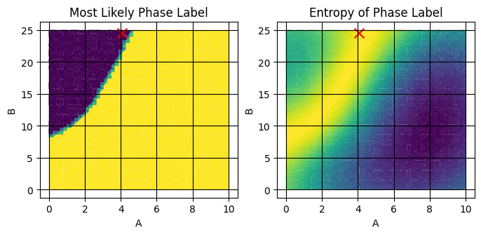
See that the red X is placed near the boundary of the two phases. Running the pipeline several times, you should see the X move about the bright region of entropy. This is because the MaxValueAF acquisition function doesn’t choose the absolute maximum, but rather randomly chooses from the top acquisition_rtol percent of the entropy.
Full Pipeline#
With that, we have a full Pipeline which defines the behavior of a decision agent! Let’s view the whole pipeline defined in a single context:
[23]:
with Pipeline() as my_first_pipeline:

    Standardize(
        input_variable='composition',
        output_variable='normalized_composition',
        dim='sample',
        component_dim='component',
        min_val={'A':0.0,'B':0.0},
        max_val={'A':10.0,'B':25.0},
    )

    Standardize(
        input_variable='composition_grid',
        output_variable='normalized_composition_grid',
        dim='grid',
        component_dim='component',
        min_val={'A':0.0,'B':0.0},
        max_val={'A':10.0,'B':25.0},
    )

    SavgolFilter(
        input_variable='measurement',
        output_variable='derivative',
        dim='x',
        derivative=1
        )

    Similarity(
        input_variable='derivative',
        output_variable='similarity',
        sample_dim='sample',
        params={'metric': 'laplacian','gamma':1e-4}
        )

    SpectralClustering(
        input_variable='similarity',
        output_variable='labels',
        dim='sample',
        params={'n_phases': 2}
        )


    GaussianProcessClassifier(
        feature_input_variable='normalized_composition',
        predictor_input_variable='labels',
        output_prefix='extrap',
        sample_dim='sample',
        grid_variable='normalized_composition_grid',
        grid_dim='grid',
    )

    MaxValueAF(
        input_variables=['extrap_entropy'],
        output_variable='next_sample',
        grid_variable='composition_grid',
    )

my_first_pipeline.print()
PipelineOp                               input_variable ---> output_variable
----------                               -----------------------------------
0  ) <Standardize>                       composition ---> normalized_composition
1  ) <Standardize>                       composition_grid ---> normalized_composition_grid
2  ) <SavgolFilter>                      measurement ---> derivative
3  ) <SimilarityMetric>                  derivative ---> similarity
4  ) <SpectralClustering>                similarity ---> labels
5  ) <GaussianProcessClassifier>         ['normalized_composition', 'labels', 'normalized_composition_grid'] ---> ['extrap_mean', 'extrap_entropy']
6  ) <MaxValueAF>                        ['extrap_entropy', 'composition_grid'] ---> next_sample

Input Variables
---------------
0) composition
1) composition_grid
2) measurement

Output Variables
----------------
0) extrap_mean
1) next_sample
We can also visualize the full pipeline using the .draw and .draw_plotly methods
[24]:
my_first_pipeline.draw();
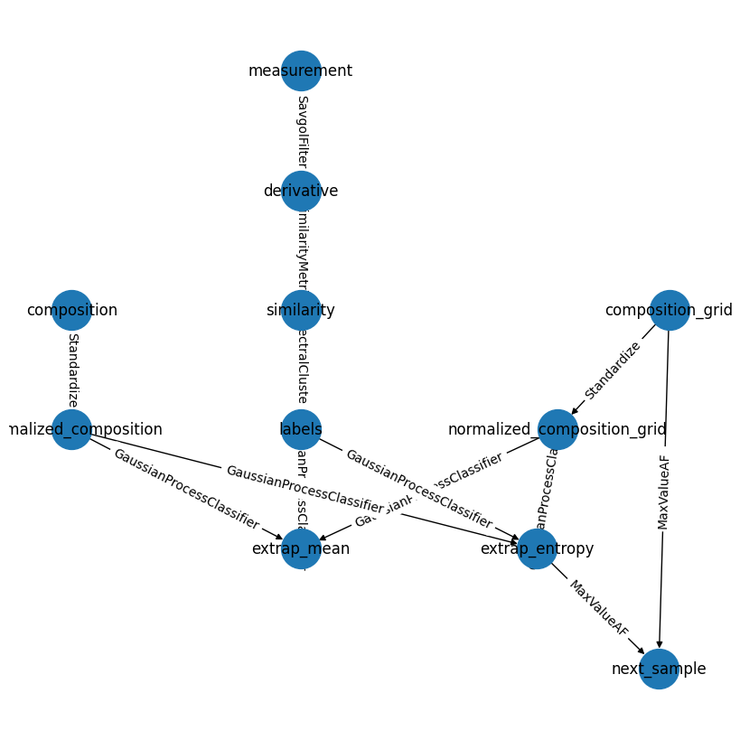
While this doesn’t always produce the more visually appealling graphs, it is a powerful way to check the consistency and flow of complex pipelines.
Conclusion#
In this tutorial, we learned how to build pipelines in using AFL.double_agent by:
Creating a new pipeline using
Pipeline()Adding data processing steps like normalization and derivative calculation
Implementing spectral clustering for phase identification
Using Gaussian Process classification to extrapolate phase boundaries
Adding active learning with acquisition functions to guide further sampling
Visualizing the pipeline structure and results at each step
The pipeline we built demonstrates a complete workflow - from raw data processing through machine learning and active learning. This modular approach allows us to easily modify individual components while maintaining a clear data flow between steps.
For more examples of AFL pipelines and components, check out the other tutorials and examples in the documentation.